
Since I work in traditional media, I sometimes need to translate the colors in a design brief into the art materials I use. As an artist, I need to not only know how the colors will interact with the paper, but also how they appear when scanned and translated to RGB or CMYK for the digital and print world.
When I first started digitizing my artwork, I was using my sketchbook to make swatches and scanned the pages to see how they compared digitally. This was not only inefficient but it produced inconsistent results, so I decided to make swatch cards for all of my watercolors, inks, gouache, and colored pencils. I keep a jar of swatches, with the names written on the back, that I will use to make the matches I need with a physical color reference, such as a Pantone guide.
I use three color reference tools: Pantone Color Bridge Coated, TruMatch CMYK Color Finder Uncoated, and Pantone Connect for Adobe Photoshop. Between my Pantone book, the digital references, and my paint swatch cards, I am able to create my personal interpretation of the colors in the brief. The benefit of this activity is that my work will always be true to the brief, but translated into a design that is uniquely mine.

Watercolor Swatches

Watercolor Swatches
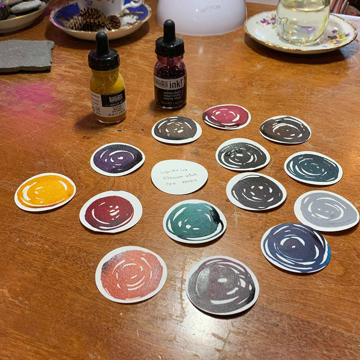
Ink Swatches

Color Reference Tools
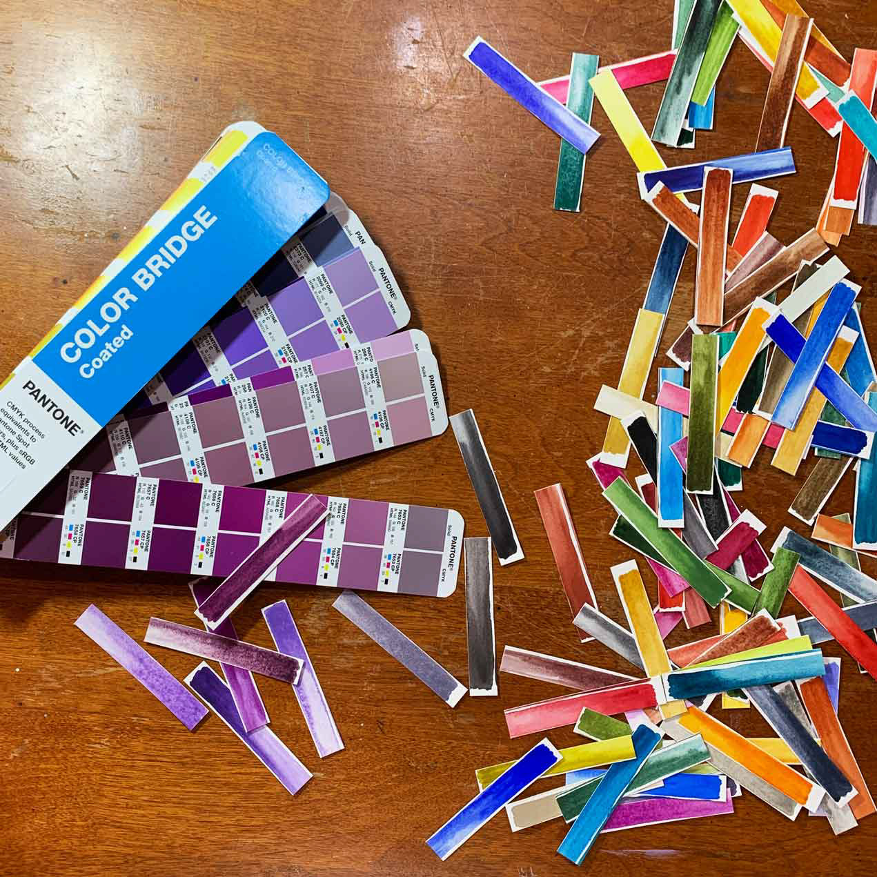
Comparing Watercolor to Pantone
